






















































Mastering the Invisible: A Comprehensive Guide to Google Messages’ Revamped Android Gestures

For the dedicated Android enthusiast, there is a specific, geeky satisfaction in discovering a "hidden" shortcut—a gesture or a tucked-away menu option that turns a mundane task into a seamless, high-speed operation. However, the world of Google’s software ecosystem is defined by a persistent, dual reality: the joy of discovery is frequently met by the frustration of constant, unpredictable change.
As Google continues to iterate on the Google Messages app, many long-time users are finding that the "muscle memory" they’ve developed over years of use is being challenged. Whether you are a power user who has meticulously customized your workflow or a casual texter who rarely explores beyond the basic input field, the latest update to Google Messages necessitates a re-learning phase. To help you navigate this transition, we have compiled an exhaustive guide to the new gesture-based landscape of the world’s most popular Android messaging client.
Main Facts: The Evolution of Navigation
The recent update to Google Messages is not merely a cosmetic refresh; it is a fundamental reconfiguration of how users interact with their data. By prioritizing gesture-based controls over traditional menu-diving, Google is aiming to make the application feel more tactile and responsive.

The core changes center on the "invisible interface"—actions triggered by swipes, long-presses, and taps that are not immediately obvious to the untrained eye. These changes are designed to streamline communication, allowing users to reply, archive, and manage message metadata with minimal friction. However, as these features are rolled out server-side, many users may find that their app behaves differently than it did just weeks ago.
Chronology of Changes
The shift in Google Messages’ UI has been gradual, reflecting Google’s broader strategy of "Material You" design language, which emphasizes fluid movement and user-centric customization.
- Early 2024: Google began experimenting with richer interaction menus, moving away from static bars to dynamic pop-ups.
- Mid-2024: The introduction of RCS (Rich Communication Services) ubiquity necessitated a more robust set of tools for managing message status, leading to the current iteration of "read" and "delivered" indicators.
- Late 2024 to Present: The rollout of the current gesture suite has standardized how users interact with individual message bubbles. This phase has seen the consolidation of options like "Copy," "Delete," and "Info" into a unified long-press menu, effectively replacing the scattered icons of the past.
The Power-User’s Gesture Suite: A Deep Dive
1. The Message Long-Press Menu
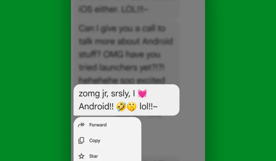
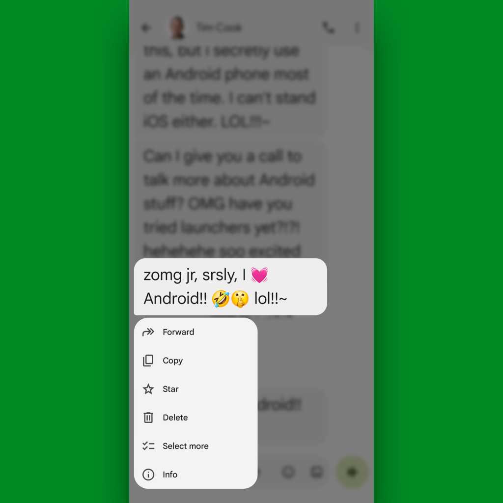
Within a specific conversation thread, pressing and holding your finger on any message now triggers a sophisticated pop-up menu. This is the most significant change to the user experience. Instead of a simple toolbar appearing at the top of the screen, you are presented with a floating interface. At the top, you’ll find reaction emojis (including custom photo-based reactions). Below that, you gain access to:

- Select More: Essential for bulk-managing threads.
- Copy: Instantly pushes text to the system clipboard.
- Info: Provides deep-level metadata, including message status and details regarding post-delivery edits.
2. Right-Swipe: The Contextual Reply
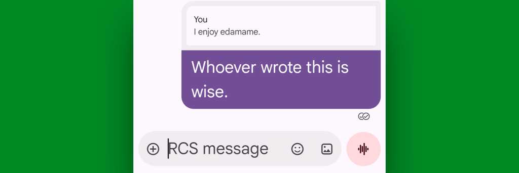
Swiping right on a specific message is now the standard for "Reply." This is a crucial tool for group chats where the conversation moves at a high velocity. It quotes the original message, providing immediate context for your response.
3. Left-Swipe: Revealing the Timestamp
In the previous version, timestamps were often displayed by default. Now, they are hidden to reduce visual clutter. A quick swipe to the left on any message reveals exactly when it was sent, a small but vital detail for professional or time-sensitive communication.
4. Tapping Your Own Messages
Tapping a message you have sent, rather than one you’ve received, now serves a specific purpose: revealing status markers. In an RCS-enabled thread, this is the quickest way to verify if your message has been delivered or read, bypassing the need to check the thread’s general status.
5. Profile Photo and Name Interactions
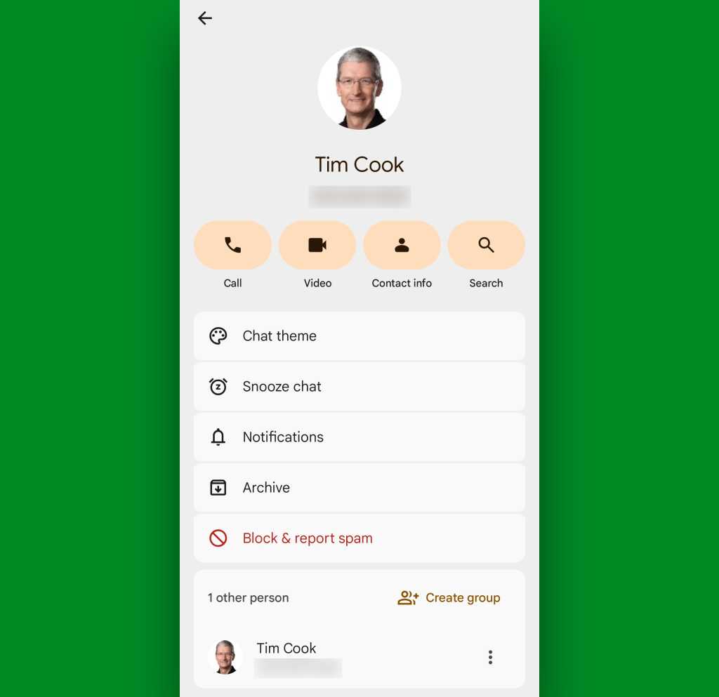
The UI has become increasingly people-centric. Tapping the profile photo at the top of a thread brings up the "Conversation Info" screen, allowing for quick adjustments to notification settings or participant management. Furthermore, in group chats, tapping a participant’s name above their specific message provides a direct path to calling them or viewing their contact details.
6. The Send Button Long-Press
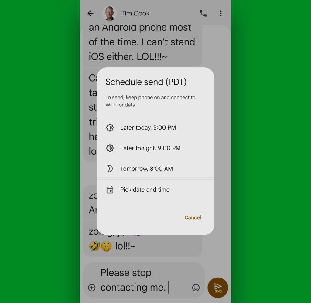
This is perhaps the most useful "hidden" productivity hack. By holding the send button instead of simply tapping it, you trigger the scheduling interface. This allows you to compose a message and defer its delivery to a more appropriate time—a feature that is invaluable for maintaining a professional work-life balance.
7. List-Level Gestures: The Main Menu
In the main inbox, the power of the swipe is fully realized. Users can configure their own swipe actions (archive, delete, mark as unread) via Settings > Swipe Actions. Additionally, a long-press on any conversation in the list reveals a secondary menu, allowing for pinning, snoozing, or blocking—all without ever entering the thread itself.
Supporting Data and User Experience
The shift toward gesture-based navigation is not an arbitrary decision by Google’s design team. Industry data suggests that as screen sizes grow, "thumb-reach" becomes a primary constraint in mobile usability. By shifting critical functions to the lower two-thirds of the screen via swipe actions, Google is significantly reducing the ergonomic strain on the user.
Furthermore, the integration of "Info" panels allows users to self-diagnose connectivity or delivery issues. In environments where RCS is intermittent, being able to quickly tap a message to see its delivery status is a major reduction in user anxiety regarding communication reliability.
Official Responses and Strategic Implications
Google has remained relatively quiet regarding the specific "why" behind every gesture change, framing the updates as part of a "continuous improvement" cycle for the Android ecosystem. However, industry analysts note that these changes align with Google’s desire to standardize the messaging experience across the globe to compete more effectively with services like WhatsApp and iMessage.
The implications for the average user are clear: Google is moving toward a "frictionless" model where the software anticipates the user’s needs. For the business user, these tools—specifically the message scheduling and bulk-management features—transform the app from a simple SMS client into a genuine productivity tool.
Implications: The Future of Android Communication
As we look toward the future, the reliance on these "hidden" gestures is only expected to increase. The transition from visible buttons to gesture-based controls is a hallmark of modern UI design, emphasizing a clean, "distraction-free" aesthetic.
For the reader, the path forward is one of active learning. While the initial frustration of "lost" shortcuts is real, the trade-off is a faster, more capable, and ultimately more efficient messaging experience. We recommend spending ten minutes experimenting with these gestures in a quiet thread to build that muscle memory.
The next time Google decides to shift the goalposts, you won’t just be a passive user—you’ll be a participant in the ongoing evolution of the world’s most versatile mobile operating system.
Stay ahead of the curve by keeping an eye on the latest Android developments. Understanding these subtle interface shifts is the first step toward true mastery of your digital environment.